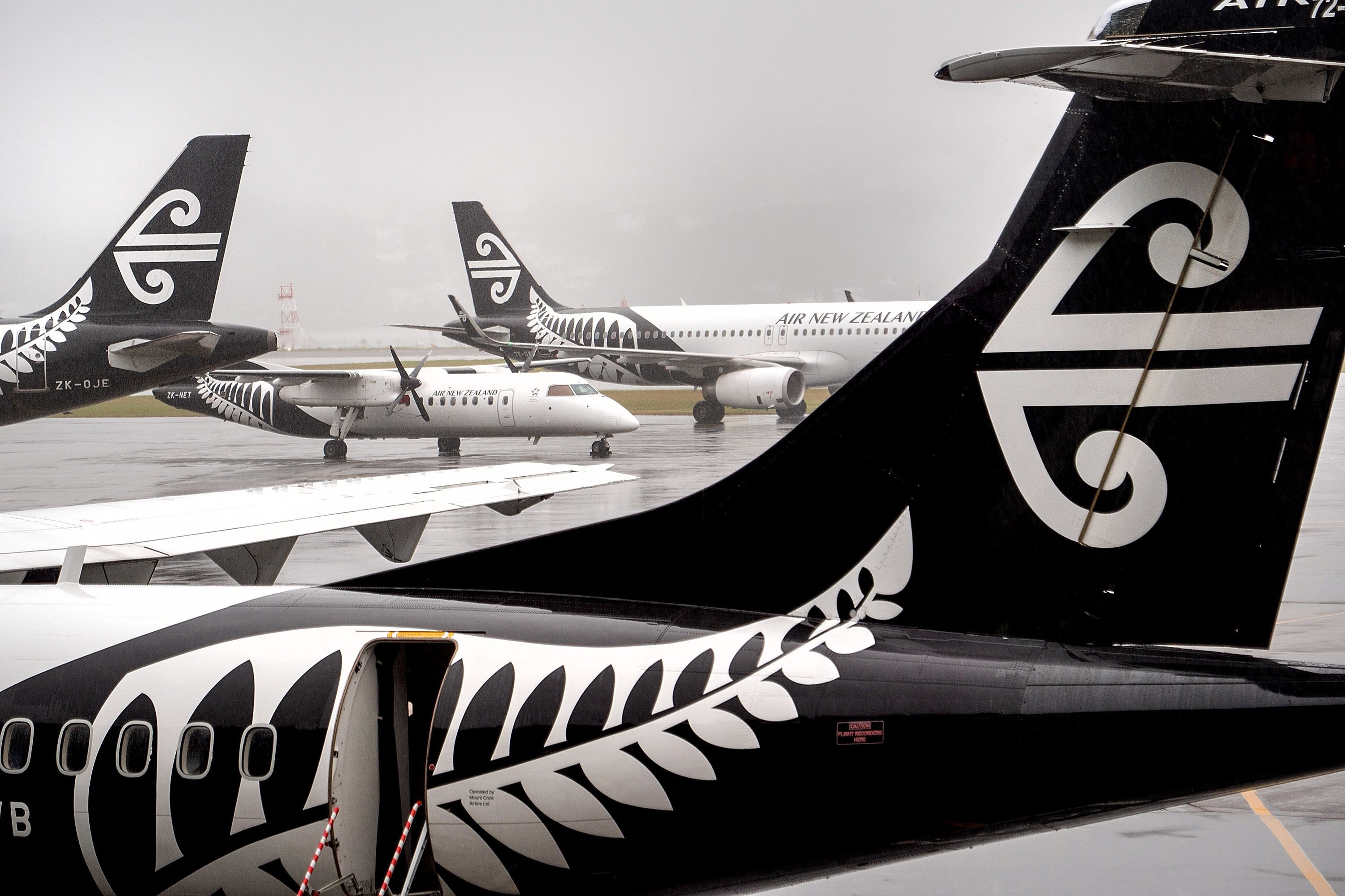
Thanks to the logo on the tail of Air New Zealand’s jets, the koru is one of the best-known symbols which represent the country abroad.
However the koru has a much deeper, richer place in New Zealand’s cultural heritage than that — which is possibly why it also features in the logos of the national museum and archives, dozens of councils and companies, on bank notes and government documents, the Hundertwasser and Tino Rangatiratanga flags, and was a prominent part of the marketing material when New Zealand hosted the 2011 Rugby World Cup.
Maori have used the design for almost as long as they have been in New Zealand: cave drawings dating back at least 500 years feature the koru.
It was immediately recognised as an important motif when Europeans first ventured to New Zealand — Captain Cook brought carvings laden with koru back to England, and artists who sailed with both Cook and D’Urville recorded ta moko which used the koru.
As with any symbol, its significance and meaning might be different things to the artist and the viewer.
It is generally agreed, however, that the distinctive koru spiral is inspired by an unfurling silver fern frond.
It has been variously explained as symbolising birth, regeneration, new life, growth and movement, and in tattooing is often used to represent a new branch of a whakapapa.
Its widespread use has raised concerns about its misappropriation, and the Intellectual Property Office of New Zealand notes the koru is a ‘‘culturally significant Maori design’’ which should be used in a way which respects tikanga.
While the importance of the koru to Maori never diminished, its more widespread recognition owed much to art.
In the late 1950s, abstract painter Gordon Walters commenced his Koru series of paintings, works now regarded as a landmark fusion of modernism with traditional Maori art.
Other artists followed in Walters’ footsteps in adopting the koru — arguably the country’s best-known painter, Colin McCahon, frequently used it in his work.
By the late 1960s, the koru was entering the commercial world, and Air New Zealand commissioned Tom Elliot to design a logo which would eventually to find its way on to tails of its aircraft.
The Air NZ logo uses the koru as part of a pattern called mangopare, which depicts the hammerhead shark.
‘‘Our koru encourages us to take pride in our heritage; to face each challenge with confidence and determination,’’ its website says.
‘‘It reminds us, too, of the people and land that make our home special and our responsibility to nurture and maintain these precious resources for our future generations.’’
Whether it actually does do any of those things is a moot point, but after 50 or so years as a logo — an eternity in advertising terms — it does show the enduring status of the koru.


