''Pavement'', Ben Webb (Gallery De Novo)
,</i> by Benn Webb")
Pavement'' features an eclectic series of portraiture and still life and includes a unique collaboration with 1978 University of Otago Robert Burns Fellow, Peter Olds. The appropriated photographic images are distressed by the addition of pigments and opalescent and iridescent washes to evoke strong reactions of melancholy or nostalgia, both in terms of their subject matter and their treatment. The result is powerful yet at the same time they are muted, contemplative and beautiful. Blacks and whites dominate portraits. However, Study I and II (Portrait/Chrysanthemum) is a blending of the face and the chrysanthemum, giving warmth to these works. The show also includes Unique Study, an image of anguish that responds to the horror in Olds' 1972 poem, Schizophrenic Highway. The use of the faded flower and butterfly still-life studies complement these works by acknowledging the fleeting lives of the portrait subjects. Rendered in soft tones and stark blacks, they beg to be viewed as beautiful and disarming yet Webb allows a certain fade to their beauty, creating a sense of longing for something past.''
''Desk Collection'', Saskia Leek (Dunedin Public Art Gallery)

Leek's early work recalls her teenage years, populated with figures in a painterly suburban background. They combine seemingly unrelated symbols and snippets of text that capture the roving, unsure imaginations of teenage girls as in the youthful zeal of The Gum Fights (1995). Later paintings in this exhibition show a more refined focus that these earlier works lack. Flattened perspectives and a colour palette of pastel pinks, blues and yellows dominate, giving muted form to familiar motifs of still life, landscape, houses and pets, as seen in Animal Home (2007). These simple, refreshing images give way to abstraction with familiar subjects sitting alongside new. The strongest paintings combine delicate muted backgrounds with linear detail, yet a bunch of grapes becomes a recurring motif and colour becomes the most defining element in this later work. Leek extends the rough, unfinished strokes on to the frames of some of these paintings, disrupting the understanding of where the painting begins and ends.
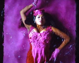
''Surrender'', Kiri Mitchell (Inge Doesburg Gallery)

The works start as large expressive charcoal drawings and this immediacy is retained in the final printed image, with multiple plates used to create movement and vibrant colour. The aquatint process allows a stark contrast between light and shadow, providing not only a mysterious dark quality but the colour around the main subjects adds to the intensity of the characters' emotions.
- by Julie Joop


![... we all become all of these things [installation view] (2025), by Megan Brady.](https://www.odt.co.nz/sites/default/files/styles/odt_landscape_small_related_stories/public/story/2025/03/1_we_all_become_all_of_thes.jpg?itok=SH-Q8KJZ)

![Poipoia te Kākano [installation view]. Allison Beck, Megan Brady, Kate Stevens West, Jess...](https://www.odt.co.nz/sites/default/files/styles/odt_landscape_small_related_stories/public/story/2025/02/1_poipoia_te_k_kano.jpg?itok=_BEDlada)