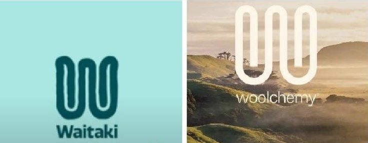
The controversial logo, which has now been rejected, was very similar to that of sustainable wool business Woolchemy.
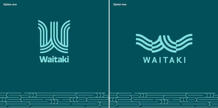
Yesterday the council’s economic and community development manager, Mel Jones, said she was "confident" the previous trademark infringement would not be an issue for the two new design options.
She said Woolchemy had not pursued the council over it.
"We have done an initial search on the internet ... Ocean Design has worked very closely with us and with the Ngāi Tahu artist to develop some new logos, which we’re quite excited about now," Ms Jones said.
The new logo — which will not replace the current district council logo — is for brand guidelines for new township and entrance signs to be installed this year, and future region marketing for Waitaki.

"There are iterations being done to the designs to reflect the feedback that we got from the community conversations before Christmas," Ms Jones said.
The brand and logo development began in October 2023.
This has included a round of "community conversations" in individual localities.
Ms Jones said the project’s $100,000 cost had been a focus in online public comment but the costs had included the "whole development of the Waitaki story".
A quick view of the council’s release online this week of the proposed new logo options shows mixed feelings from Waitaki residents.

"The colours mean nothing to the district," another said.
Ms Jones said the logo design exercise had been "challenging".
It had even divided key stakeholders, the project team and council staff.
"We’re confident we’ve got two really interesting routes forward — as ever, this is always very subjective."
Given the previous debate, the council had decided to gauge opinion via social media first.
Ms Jones said further consultation with Te Rūnanga o Moeraki was planned next month.


