

Waitaki District councillor Guy Percival made the comment yesterday as the council debated a stylised "W" under a $100,000 branding exercise including development of the "Waitaki Story" for the district.
Councillors gave their assent for the stylised "W", for economic marketing and signage across the area.
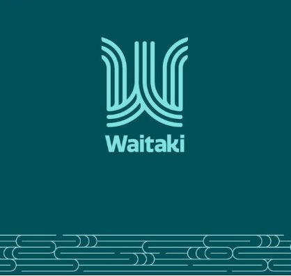
It came after the council was dogged by controversy in late 2024.
An initial stylised "W" was publicly lambasted when a potential copyright conflict with Woolchemy was overlooked by its contractor.
Meanwhile, embarrassed communities like Palmerston have begged for their tired locality signs to be replaced after years of waiting.
That was all ushered away yesterday as the council’s new director of strategy, performance, and design Joanne O’Neill told the council two new options were now being pursued.
The preferred option aimed to "put Waitaki on the map".
"We have had really good community feedback.
"We are confident with both options," Ms O’Neill said.
Crucially, Te Rūnanga o Moeraki supported both options, she said.
Ms O’Neill said the option being recommended was more graphically striking.
"We followed the original direction of the ‘W’.
"Certainly when we looked at the feedback from social media, this was the one that was more universally appealing," she said.
The second option had been "more artistic" and symbolic and more naturally fitted the rūnanga’s vision.
"However what we have done is look at the logo in context.
"First and foremost we want a logo to work strongly on signage," Ms O’Neill said.
It will be imprinted upon new district locality signage that is now being developed in-house at the council.
Ms O’Neill said commissioning the new district locality signs incorporating the logo was still subject to procurement.
"We are hoping to have some new district signage up by the end of June ... but this is still a long-term thing."
Cr John McCone commended the work.
But in the context of more pressing priorities for the district "it’s not on my priority list".
Cr Jim Hopkins said it was important to place the logo in its rightful context: "as an element as a small part on signs identifying settlements".
"It’s not the sum total of the brand," he said.

But equally "it is something that is important for quite a few people out there," Mr Kircher said.
"We constantly get criticised about the state of the town entrance signs.
"This is a key project for a lot of people ... They want to be proud of their towns, they want their entrances to look good."
The current ones were "embarrassing" and, "the sooner we get on with it the better".
Cr Guy Percival said the proposed logo was meant to be predominant in the marketing of the district.
But he was underwhelmed.
"We need a logo that clearly identifies any aspects of the amazing attractions or landscape of the Waitaki area.
"If you are a visitor when you see it, it doesn’t hit you with anything," he said of the logo.
"It’s just a sign you could put on a watermelon to sell it."
Cr Jeremy Holding said it was "a shame" the project logo design had overwhelmed what was supposed to be about the district’s whole identity.
Mr Kircher said the sign project will utilise funding previously budgeted for Tourism Waitaki.


