One of my ancestors was a British naval captain, John Rodolphus Kent, who visited the harbour on July 17, 1823, 200 years ago today.
He named it Port Oxley and, although still used by Australians in 1837, the name didn’t stick.
The Weller Brothers had set up a whaling station in the harbour in 1831 and referred to it as Otago, a phonetic spelling of Otakou, as it was spoken in the local dialect.
The name Otakou actually refers to a channel in the harbour.
The possibly apocryphal story I was told many years ago, was that someone had arrived in a boat and asked, ‘‘what is the name of this place?’’ As they were asking from a boat sitting in the Otakou channel, the answer was obvious to the Maori person replying.
By the 1840s, Otago was the dominant spelling when it was adopted for the whole province.
It was also the name chosen by the University of Otago when it was launched in 1869.
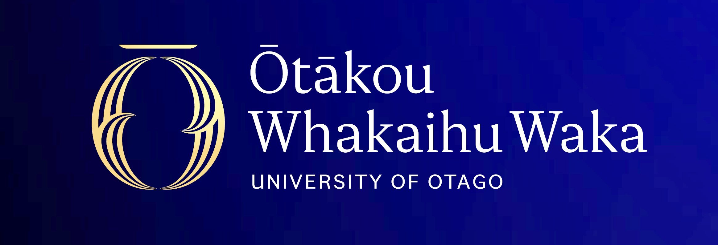
Last week the council of the University of Otago decided to rebrand the university by giving it a new logo and changing the Maori name to Otakou Whakaihu Waka.
It was chosen in collaboration with the local Ngai Tahu people, referring to Otakou as a place of many firsts.
During the consultation on the changes there were strong feelings.

Some objected to the increased visibility of the Maori name.
I think this was linked to a resistance to the growing number and complexity of Maori names used by local and central government.
There are two schools of thought. I like straightforward names that tell me what something is, but my eldest daughter teaches the meaning and symbolism of Maori art at Te Wananga o Aotearoa.
To her the many layers of meaning are what is important.
To me in my 60s, brain overloaded with more information coming in every day, I just want to cut to the chase.
I like the name Oranga Tamariki because it tells me what it is about, but Waka Kotahi for the Transport Authority was annoying as I wasn’t sure of the connection.
Interestingly, I wasn’t always like this.
We gave both of our daughters five syllable Maori names that have a huge depth of meaning.
But I was in my early 20s.
I think if we had the 17 children my grandparents did, I would have possibly wanted to call the last three vowels, probably A, I and U, as they are the quickest to say.
While some claim they want entirely descriptive names instead of Maori names, I don’t think they are being entirely genuine.
When has Pakeha society ever done that?
There are myriad businesses, buildings and organisations that have names that don’t describe what they are for.
In Dunedin, Queen Mary is where you go to give birth, Forsyth Barr is where you go to watch the rugby, the Meridian is for shopping and if you tell the rest of the world you are going to the Octagon, they think you are participating in mixed martial arts. Even Hamilton’s Rugby Park, as descriptive a name as you could ever find, has been changed to FMG.
There are few names that tell us simply what they are, and we adapt.
I can understand why others my age struggle with unfamiliar names. I’m sure it must have been someone my age who took the names Captain Cook recorded of Te Ika-a-Maui and Te Waipounamu and changed them to the North Island and South Island, just in case they forgot where they were going.
While the university’s Maori name change is the issue to some, to others it is the removal of the coat of arms from the logo.
While the university may have used a coat of arms from its earliest days, as I found out on the wall outside the council chambers, it only became official in 1948, nearly 80 years after its founding.
The problem with the coat of arms as a logo, and the reason steps were taken to look at rebranding in the first place, is that it doesn’t look good on the device most of our prospective students use to engage with the university, a smartphone.
I invite you to look it up on your smartphone as I did.
It is already a problematic symbol as it is impossible to tell what it is.
As an alumni and staff member, I like the new branding with its correct spelling, its connection to the harbour and the local hapu, where the O reminds me of my beloved Otago rugby team and its shape evokes a Celtic knot that binds us all together.
— Anaru Eketone is an associate professor in social and community work at the University of Otago.


