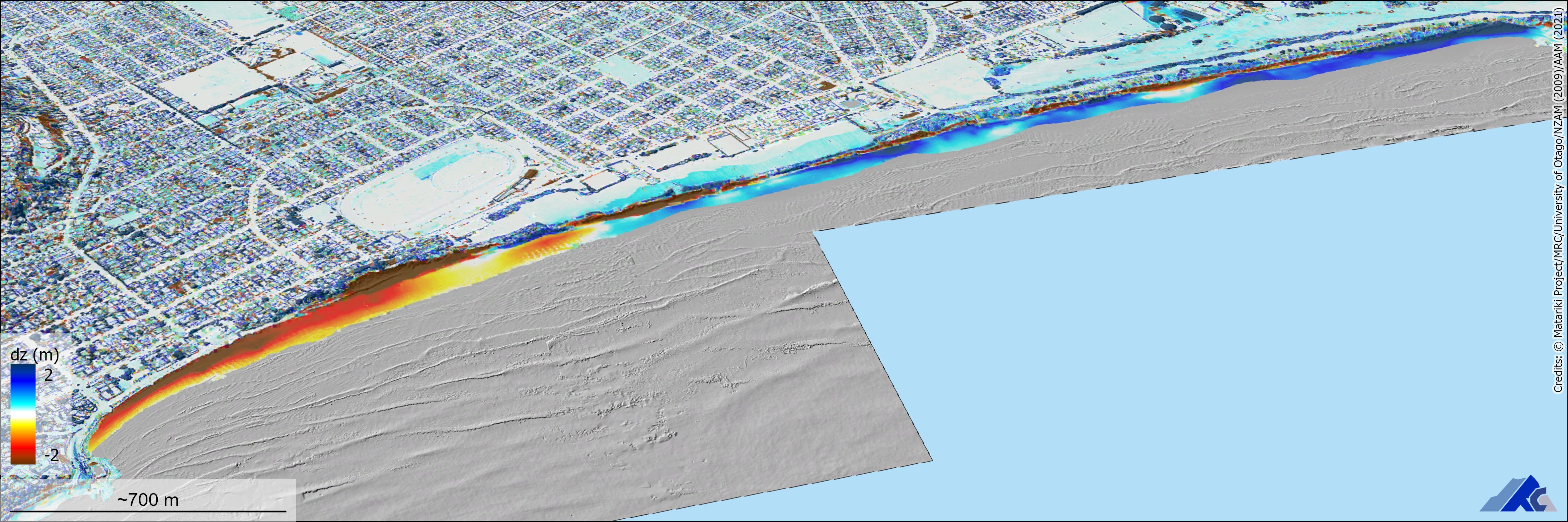
University of Otago researchers have developed a way for anyone to put on "X-ray glasses" and see beyond recently released laser-accurate elevation data available for Dunedin.
University of Otago associate professor Pascal Sirguey said the interactive 3-D map created at the School of Surveying clearly showed where trees were felled or had grown, where buildings had been demolished or built, or where sand had been stripped from beaches and where it built up, from 2009 to 2021.
"The city is dynamic; it changes a lot, rapidly," Prof Sirguey said.
By combining 2009 light detection and ranging (lidar) data for the city with recently released lidar measurements of Dunedin’s inner city, people could see something akin to a heat map of the changing cityscape.
Blue areas around the Dunedin Botanic Garden showed significant vegetation growth in the area from 2009 to 2021.
A red block in the city centre showed the demolition that had taken place for the new Dunedin Hospital.

Surprisingly, near Lawyers Head there had been a significant accumulation of sand, including revegetation of the dunes, Prof Sirguey said.
"I’m not a coastal specialist, but I think this is the kind of data when processed, and manipulated, and made available to people who are specialists of the processes at work, [they] can really use to inform and understand ... the dynamics of this environment."
With Provincial Growth Fund-supported lidar mapping now becoming publicly available, Otago researchers found they were able to manipulate the 2009 data set, that was similar but not the same as the new 2021 data, so that the two maps they created could be merged coherently.
The publicly available interactive map on the School of Surveying webpage appears similar to the well-used Google Maps.

There is also "hillshading", showing elevation variations, and the "heat map" that shows positive and negative changes to elevations, including rooftops, tree-tops, or the beach.
A slider further allows users to observe an area in a "before and after" setting.
"This is putting your X-rays glasses on and seeing beyond the data," Prof Sirguey said.
"This is what the data really enables us now to do — inform any future decision based on the evidence that it provides."
Creating the map coincided with a new curriculum for surveying students that included two new papers in the first year to learn new surveying techniques and geospatial science skills, Prof Sirguey said.


