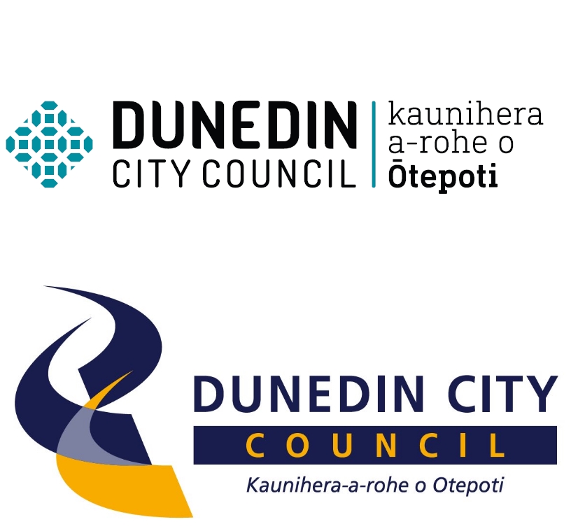
Mayor of Dunedin Dave Cull, announcing the launch of the new brand today, said the previous logo had been in use since 2005.
"That was some time ago and we wanted to update our brand to better reflect who we are and what we do, and to establish a strong, new visual identity," he said.
DCC chief executive Sue Bidrose said the new brand included the literal Māori translation for the DCC – kaunihera a-rohe o Ōtepoti – and had been endorsed by the Māori Participation Working Party.
"The new logo, colours and fonts signify a professional, warm and inclusive image, which reflects who we are.
"I’m particularly proud of the strong visual reminder of our great working relationship with Ngāi Tahu, the Crown’s treaty partner."
DCC communications and marketing manager Graham McKerracher said the new brand did not include a slogan and the move away from the blue and gold gave the DCC its own strong visual identity.
The new branding would appear immediately in some areas, such as on the DCC website, but would be rolled out over time in others, such as brochures and business cards.
The initial costs were expected to be about $23,000 and would be met from the existing council communications and marketing budget.
The new brand was developed in-house by the marketing and design team to mitigate external costs.
Comments
Why the change? How does it - better reflect who we are and what we do, What are the true costs - Changing current stationary, logos, on cars, trucks, buildings, The older one is better and has the colours linked to Otago. Is this Culls last stand before he leaves does this mean Cull is not standing for Mayor?
The font and Te Reo are nice, but the image? It looks like a morrocan tile - how does it have any significance to Dunedin at all? Any generic logo creator on google could have come up with this or better. Did DCC do any market testing or did they ask their 500+ employees their opinion before choosing a design, surely they would have brought up some suggestions.
110% being on the money. one would hope so, I don't recall the Council ever mentioning it was redesigning the logo, just waiting for the standard DCC procedure "Rework"
Not impressed. How about they at least ask the public before wasting more council money on something that isn't needed.
The new logo doesn't seem to represent this city at all, no distinguishing features.
For crying out loud people, vote for someone other than Cull this election!!!
Now I know why the potential merger with ORC was put on a low priority. The council had to spend their time working on a new and unneeded logo.
From a person who has worked in community marketing = this would have to be the worst change I have seen. Tragic. If that is supposed to be a celtic knot then thats a failure.
Shame there's not enough money left after the new logo to clear leaves out of drains. I saw flooding all over the place today from blocked drains.
To be fair, the leaves have only fallen down at this time of year millions of years so how was the DCC expected to know this would happen at the end of autumn.


